Key Takeaways
- User Experience Enhancement: The three-line menu icon, or hamburger menu, significantly simplifies navigation, improving user satisfaction and engagement on websites and apps.
- Space-Saving Design: Its compact design is crucial for small businesses with limited screen space, creating a clean interface that prioritizes content presentation.
- Widespread Adoption: Popular platforms like Facebook and Instagram utilize the hamburger menu, showcasing its effectiveness in mobile and web design for streamlining complex menus.
- Best Practices for Implementation: Key strategies include consistent placement, maintaining the recognizable three-line design, responsive functionality, and clear labeling to optimize navigation.
- Adapting to Trends: Keeping up with modern design trends that favor minimalism and efficiency can enhance user engagement and keep small businesses competitive in the digital marketplace.
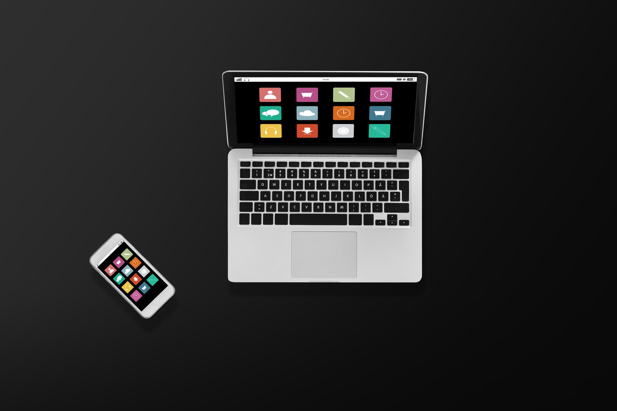
In today’s digital landscape, user experience is everything. You’ve likely encountered the three-line menu icon, often referred to as the “hamburger” icon, on countless websites and apps. This simple yet effective design element has transformed how we navigate online, offering a clean and intuitive way to access menus without cluttering the interface.
But why is this icon so popular? As screens get smaller and design trends evolve, the three-line menu provides a sleek solution for organizing content. It allows you to hide navigation options until needed, making your browsing experience smoother and more efficient. Let’s dive deeper into the significance of the three-line menu icon and how it impacts your interactions with digital platforms.
Overview of the 3 Line Menu Icon
The three-line menu icon, commonly referred to as the “hamburger” icon, plays a vital role in enhancing user experience for small business websites and apps. This simple design consolidates navigation, allowing users to access menus effortlessly without overwhelming the interface.
You can appreciate the effectiveness of the three-line menu as screens become smaller and device diversity increases. Its ability to declutter digital spaces becomes essential for tech-savvy users seeking efficient browsing. This menu design enables you to prioritize content organization, ensuring that visitors locate essential information quickly.
Utilizing the three-line menu icon benefits your small business by streamlining user interactions. It simplifies navigation while maintaining an engaging aesthetic. Users appreciate intuitive design elements, leading to improved satisfaction and potentially increased business engagement.
Importance of the 3 Line Menu Icon
The hamburger menu serves as a vital navigation element that enhances the user experience on your website or app. Its adoption has become crucial for small businesses looking to maintain an efficient and organized interface.
Enhancing User Experience
The hamburger menu significantly enhances user experience by simplifying navigation. By consolidating menu options, you prevent users from feeling overwhelmed, especially on mobile devices. This design allows tech-savvy customers to find what they need quickly without distractions, leading to increased satisfaction and prolonged engagement. Ultimately, a well-implemented hamburger menu can drive more interactions on your platform, reflecting positively on your small business.
Space-Saving Design
The space-saving design of the hamburger menu is especially beneficial for small businesses with limited screen real estate. By hiding navigation options under this icon, you create a clean and uncluttered interface. This approach not only prioritizes content but also aligns with modern design trends that emphasize minimalism. A neatly organized menu allows users to focus on your offerings, enhancing their browsing experience and promoting your brand effectively.
Common Usage in Web and Mobile Design
The 3-line menu icon, commonly known as the hamburger menu, plays a vital role in web and mobile design, particularly for small businesses. It streamlines navigation, presenting a clean interface that enhances user experience.
Examples in Popular Applications
Many widely-used applications utilize the hamburger menu to condense navigation. For example, apps like Facebook, Instagram, and Twitter feature this design element to compact complex menus into a simple icon. By implementing this familiar design, your small business app can improve usability, allowing users to access key features without distraction.
Design Trends Featuring the 3 Line Menu Icon
Current design trends favor the 3-line menu icon for its efficiency and minimalism. As mobile usage surges, this icon becomes essential for navigating small screens. The design supports the tech-savvy audience’s expectation for straightforward navigation. Your business can adopt this modern approach to enhance user engagement and maintain a competitive edge in the digital landscape.
Best Practices for Implementing the 3 Line Menu Icon
- Visibility and Placement: Place the hamburger menu icon in the top-left or top-right corner of the screen. Users typically expect it in these locations. The top-left alignment works well for left-to-right languages, while the top-right offers thumb-friendly access for mobile users. Consistent placement across all web pages ensures a smooth user experience.
- Icon Design: Utilize the standard three horizontal lines (☰) for the hamburger menu. This design is widely recognized and understood, making navigation intuitive. The icon should be large enough for easy tapping on mobile devices. If your brand identity allows, consider a custom icon that resembles the three-horizontal-lines symbol but remains recognizable to users.
- Responsive Design: Implement a responsive design to ensure optimal performance across devices. Your hamburger menu icon should function seamlessly on various screen sizes, especially for your small business customers accessing your site via smartphones.
- Clear Labeling: Use clear labeling to inform users about the menu’s content. Incorporate text or icons next to the hamburger menu if space allows. This aids users in understanding their navigation options, enhancing the overall experience.
- Testing and Feedback: Conduct user testing to identify any usability issues with the hamburger menu. Gather feedback from visitors to your small business website and adjust the design accordingly. Adaptation is key to improving user satisfaction and engagement.
By following these best practices, you can create an effective hamburger menu icon that enhances the user experience on your website, crucial for your small business in a technology-driven market.
Conclusion
Embracing the three-line menu icon can significantly enhance your website or app’s user experience. By simplifying navigation and decluttering your interface, you’ll make it easier for users to find what they need. This design not only aligns with modern aesthetics but also caters to the increasing demand for mobile-friendly solutions.
Implementing best practices for the hamburger menu will ensure it serves its purpose effectively. Prioritizing visibility and intuitive placement can lead to higher user satisfaction and engagement. As you adapt to evolving design trends, the three-line menu will remain a powerful tool in your digital strategy.
Frequently Asked Questions
What is the hamburger icon in web design?
The hamburger icon is a three-line menu symbol commonly used in web and app design. It provides a clean and compact way to access navigation menus without cluttering the interface, especially beneficial for small screens.
Why is user experience important in digital design?
User experience (UX) is crucial because it affects how easily users can navigate and interact with websites and apps. A positive UX leads to increased satisfaction, longer engagement, and a better chance of conversion for businesses.
How does the hamburger menu enhance user experience?
The hamburger menu simplifies navigation by hiding complex menus, allowing users to focus on content. It helps prevent overwhelming users, especially on mobile devices, and helps tech-savvy customers find information quickly.
Where should the hamburger menu be placed?
The hamburger menu is best positioned in the top-left or top-right corners of a screen. This placement is familiar to users and makes it easy to access the menu quickly.
What are the best practices for using the hamburger menu?
Best practices include ensuring the icon is large enough for easy tapping, using the standard three horizontal lines, providing clear labels for menu items, and employing responsive design for various screen sizes.
Why is mobile design important for the hamburger menu?
With the rise of mobile usage, a well-designed hamburger menu is essential for maintaining a clean interface and efficient navigation. It helps small businesses create user-friendly experiences that cater to mobile visitors.
What popular apps use the hamburger menu?
Well-known applications like Facebook, Instagram, and Twitter utilize the hamburger menu to condense their navigation, helping users find features without cluttering the interface. This trend reflects modern design practices in mobile applications.
How can the hamburger menu improve engagement for small businesses?
By offering a clean, intuitive navigation method, the hamburger menu can enhance user engagement. A well-implemented menu allows users to find what they need quickly, leading to increased satisfaction and the likelihood of returning visits.
Image Via Envato: dolgachov